Luxury Brands and their Iconic Colors
Iconic brands need iconic colors, its about being noticeable, while continuing to be subtle. I know when I see a woman walking around the city with a specific color orange shopping bag, I know she just spent a pretty penny at Hermès. I also assume that the woman carrying that bag has status, money, and class. By seeing this color alone, I have made an assessment of the person carrying the bag, along with being able to spot this bag. A color can really define a brand and many of these luxury brands have taken on their own color branding.
Well Hello Hermès Orange! This vibrant orange colors first appearance was 1942, after the Second World War when they had many, many shortages, along with cream colored boxes. According to the Hermès website, the supplier did what he had to do and resorted to what he had left, Orange. Thus Hermès Orange was born and it became the type of color that was so distinct that it became iconic and very noticeable amongst fashion fanatics or pretty much anyone who knows the brand.
How gorgeous, lively, and vibrant is this color ? Bottega green was extremely popular a few years ago and I continue to love this green and associate the brand with it. The color is a form of emerald that is eye-catching and has an amazingly bright hue. Though it is not as old as Hermès’ Orange it is still now just one of those things to be associated with the iconic brand, Bottega Veneta.
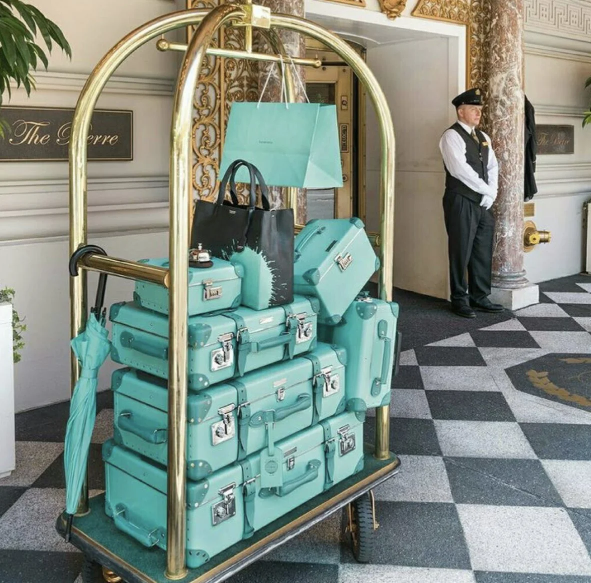
I first heard of Tiffany Blue from TV, shows like breakfast at Tiffany’s and in scenes when a excitedly woman receives that Tiffany blue box. I grew up on the words “Tiffany blue” but the world has been blessed with this beautiful classy color since 1837. The New York jewelry company was founded in 1837 by Charles Tiffany and John Young but the color was first ever used in 1845 on the cover of Tiffany’s Blue Book. The Blue Book is Tiffany’s annual collection of amazingly crafted jewels. I believe that this may be one of the oldest and more iconic colors on my list, possibly one pf the most romantic as well. As it is associated with love and most importantly beautiful diamonds.
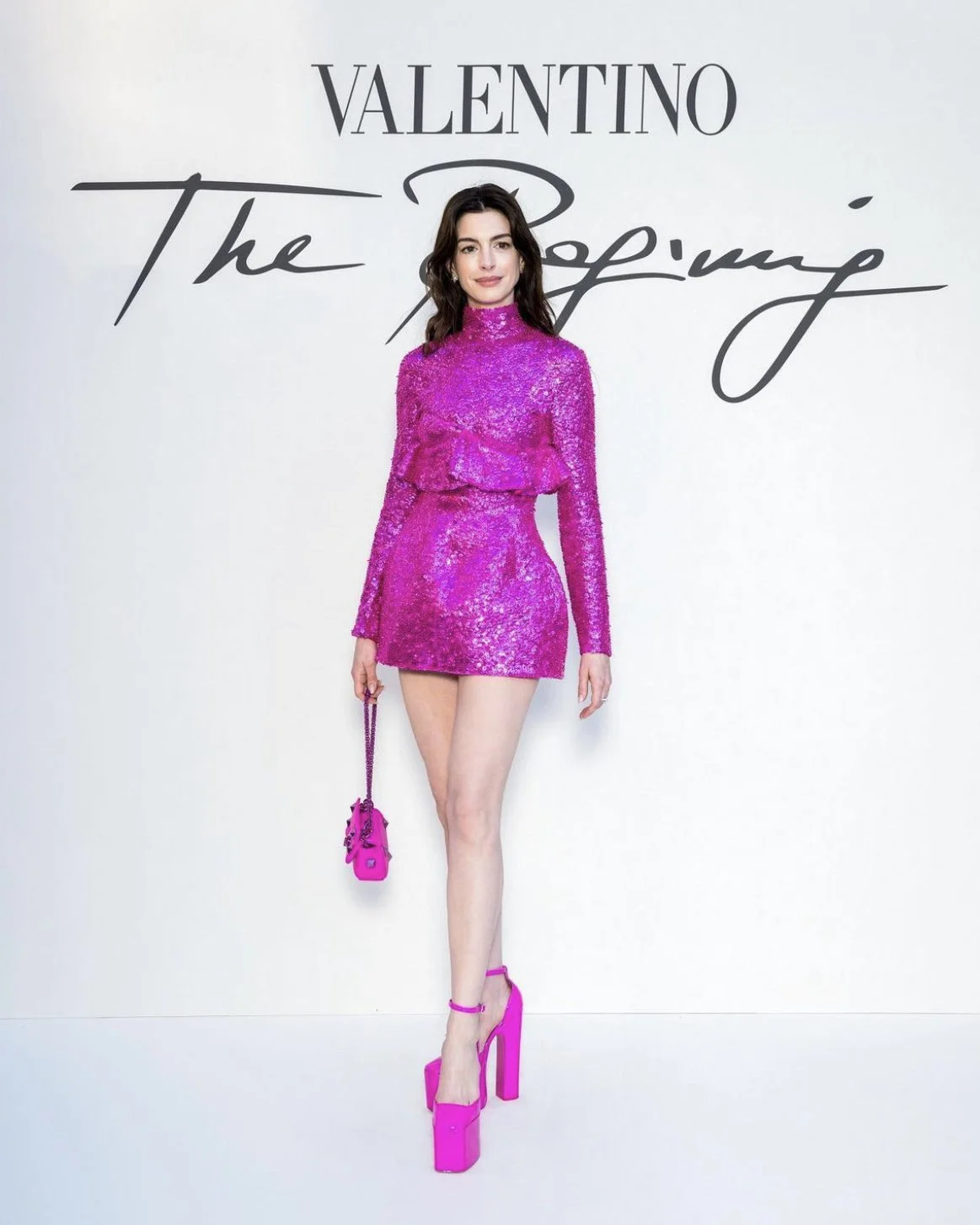
Valentino PPPink is more of a new color branding, I think most people begin to think of red when they think of Valentino. They used the color red way longer than Valentino Pink, but it seems like their creative director Pierpaolo Piccioli wanted some change for the brand. If you haven’t noticed, almost ever celebrity they have been dressing is drilled in this shade of pink to the point where the color is now heavily associated with the brand in a glance. I have a few videos where you can see this pink shade in action on the Khaurafab social accounts.


